What are websites and why are they important?
The history of websites comes from the early 1990’s when the Internet first began creeping into our computers. Everyone had to have one! Over time, it became necessary to be considered a legitimate business, but there was a huge problem. The Internet was a disorganized mess of information that was soon to get categorized and indexed by the likes of Lycos, Yahoo, and ultimately Bing and Google, the king of all search engines.
Search Engine Optimization (SEO)
That’s where search engine optimization (SEO) comes into play. In order to be found online, and to not have to click through 40 pages of listings, we have to get savvy with SEO to a certain extent. Some will argue that today you really only need social media presence and some landing pages to get noticed.
I think we need both.
Social Media Channels
We do not own our social media channels, but we do own our websites. Imagine if you put all your business efforts into Facebook marketing and had no other way for people to find you. Then one day Facebook goes belly-up, or Mark Z decides to make you pay for every feature you use, readership goes down, or a new channel comes along. What happens to your brand?
Static Pages of Websites
Use the upcoming blog posts at socialmediatrafficschool.com/blog to create the static pages of your website, which is your online storefront. Do not get your website confused with your landing pages or marketing pages. The item you’re putting on sale this month does not cause you to have to change your entire website. The only things that should change on your website are your current offers, your blog posts, your pop-ups, and maybe refresh your pictures from time to time.
Let's start with the home page.
We entertain often, and even though our house is lived-in and a little messy most of the time, we all know what it means to get the house “party ready”.
Our websites are our online homes. First impressions can make or break us when it comes to our businesses.
Is your home page “party ready”?
When you invite people into your home, you are showcasing your personality, surroundings, the things you love, and most of all, how you can help someone solve a problem.
Why not create that homey environment for your website guests?
Above the Fold
When someone first visits your website, pay particular attention to what lies “above the fold”. From a desktop, this is the area that you see before you scroll down.
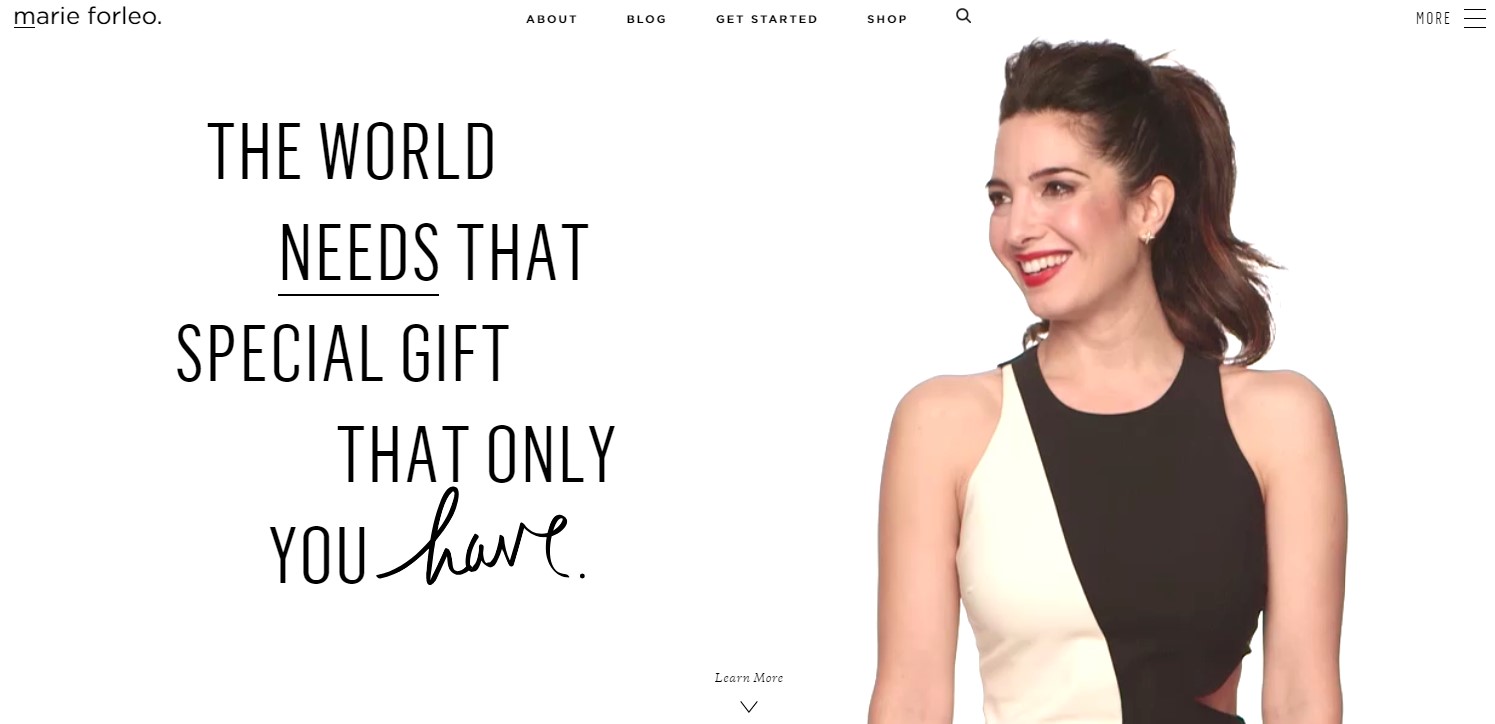
This is the top of Marie Forleo’s home page. When you go to marieforleo.com, she actual enters the screen in a floating video (which is likely an HTML5 rendering). This showcases that she is the person behind this business. It’s her personal brand, her personal enterprise.
The quote indicates that she is here to help you deliver your gifts to the world. That screams entrepreneurship, doesn’t it? Well, guess what! That is exactly who she helps with her B-school offer. Notice that you don’t see B-school mentioned here.

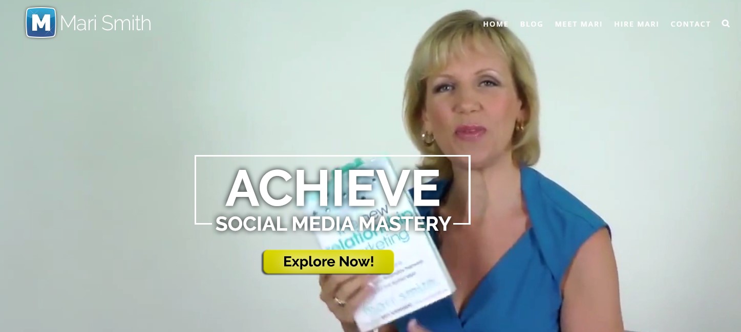
Mari Smith is also a personal brand. Mari also has an HTML5 video that shows her doing her thing as an author, speaker, and master of social media. Take a look at www.marismith.com to see the full rendering.

My site is also a personal brand. My objective is to help you accelerate marketing and advertising through education. I ask them to download my free checklist. I also offer freebies at various times and switch them out.

There are 3 elements to consider for Above the Fold placement.
1. What do you want your website visitor to do FIRST?
- Read your blog
- Review your home page
- Contact you
- Look at your offers
- Shop
The eye travels to the top right corner first, so make your menu item in that place the first thing you want them to do.
2. What solution do you provide to your clients?
- Reduce stress eating for busy moms
- Simplify entrepreneurial business accounting
- Meditate chronic pain away
- Make luxury travel experiences the norm
- Generate leads through Facebook advertising
Your solution (or slogan) should be front and center with your image showing the personality and essence of your brand.
3. What is your call-to-action?
- Call now for a quote
- Sign up for a discovery call
- Grab this free guide or e-book
- Take a tour
- Play a game
- Take a quiz
- Read this article
- Watch this video
- Scroll down
A call-to-action is where you want the eye to travel next. Either take the person below your slogan or to the bottom right side of the page to do something else. Maybe you just want them to Scroll Down to see more.

Below the Fold
If someone takes a journey through your website next, congratulations! You have won the first battle of getting them to stay on your website. Just getting someone to look below the fold is a feat in and of itself.
Analytical Note: When someone leaves your site after viewing only one page, this is called bounce rate. Your Google Analytics tracking code allows you to see this statistic.
Bounce rate rule of thumb for multi-page sites
- 26 to 40 percent = Grade A
- 41 to 55 percent = Grade B
- 56 to 70 percent = Grade C
- Higher = Ask for help understanding why!
Not all high bounce rates are cause for alarm. If someone grabs your freebie right away, and your call-to-action takes them off your site, your bounce rate would be reported high, so make sure you understand where they are traveling to next.
What content should you place below the fold?
That depends on your objective as a business.
- If you want someone to buy your software, you probably should demonstrate saving time and ease of use with a quick video or animated gif.
- If you want someone to trust you know what you’re doing, using their language to highlight their problems in related blog posts.
- If you want them to be enticed to take a worry-free vacation, pictures of happy vacationers at the destination and activities are a must!
- If you want them to use your solutions for child care, get testimonials from a stress-free parent with a picture of a happy, healthy child.

If you’d like to include a smattering of all the elements of your site, you can put it all on your home page in a condensed format. Then expand into more pages as you build out the rest of your site.
Home Page Template
This is a sample template for an all-in-one home page. No matter what you choose to put on your home page, your links should lead to an Opt-in Landing Page, to view your Blog Page or Blog Posts (include calls-to-action), your About Page (include calls-to-action), your Work with Me page (include CTA’s), your Shopping Page (sales), your Contact Page (to set an appointment or ask a question) or something else related to your business that is TRACKABLE or GENERATES LEADS and/or SALES.
Leading your visitor to an outside source that takes their eyes off your brand before they give you their email address, read your blog, or buy something from you creates a trap door situation that makes you lose potential leads and sales.
|
Logo or Company name |
Menu Items with the first thing you want them to do HERE |
||
|
Header image with personality |
|||
|
Call-to-action or blog post |
Call-to-action or blog post |
Call-to-action or blog post |
|
|
Greeting, Your Story, Why You |
|||
|
Testimonial or social proof |
Testimonial or social proof |
Testimonial or social proof |
|
|
Call-to-action |
|||
|
Footer with social follow, extra menus, terms & conditions, privacy policy |
|||
Discover more about how to build the content for your own website by joining my free classroom. The next few blog posts will detail the major pages of your website, so you can build it yourself.
How to Raise Your Influence Online with a Media Page
Get content-making tips and my FUNNY HOLIDAYS calendar for FREE for daily content inspiration!


